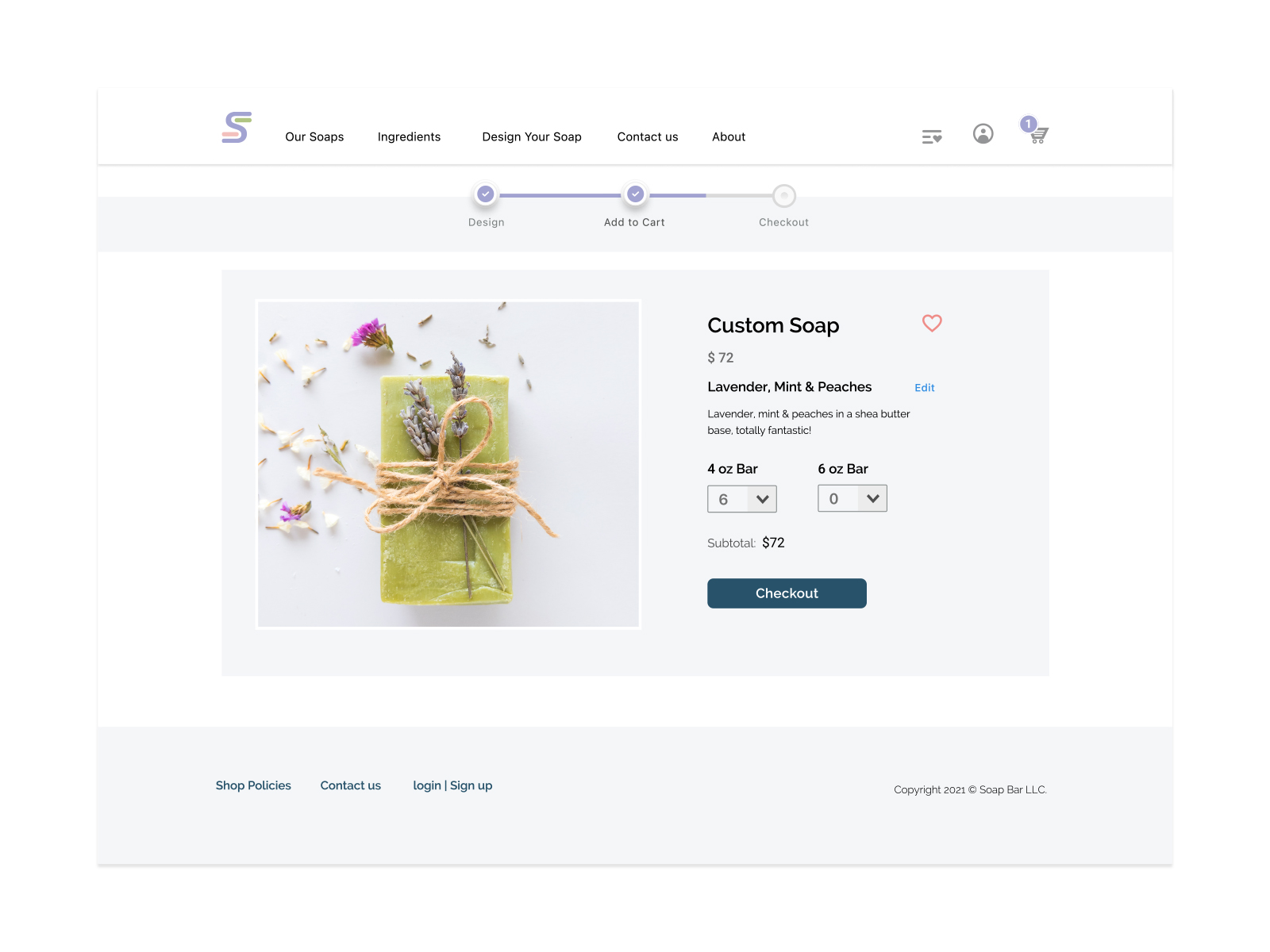
Soap Bar
WEBSITE
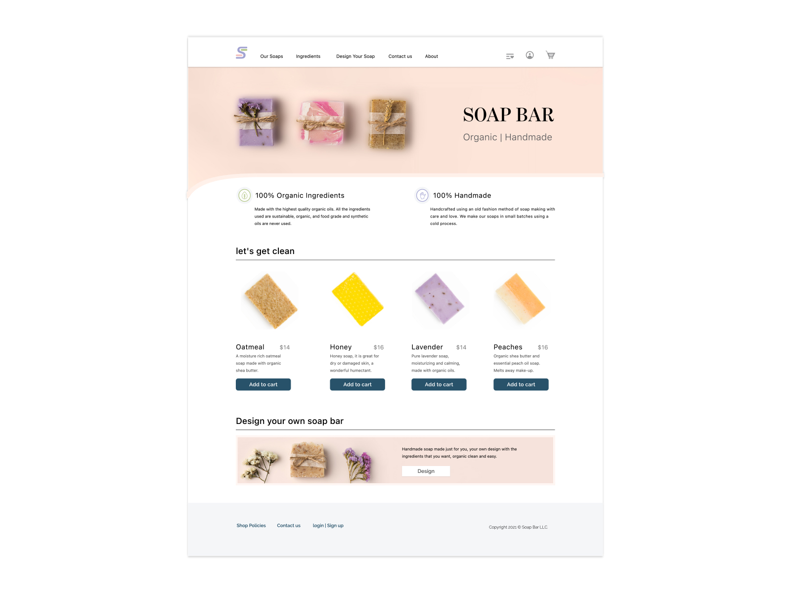
After years of selling on Etsy the client wants to add a website to allow users to design their customized handcrafted soap.
OBJECTIVE
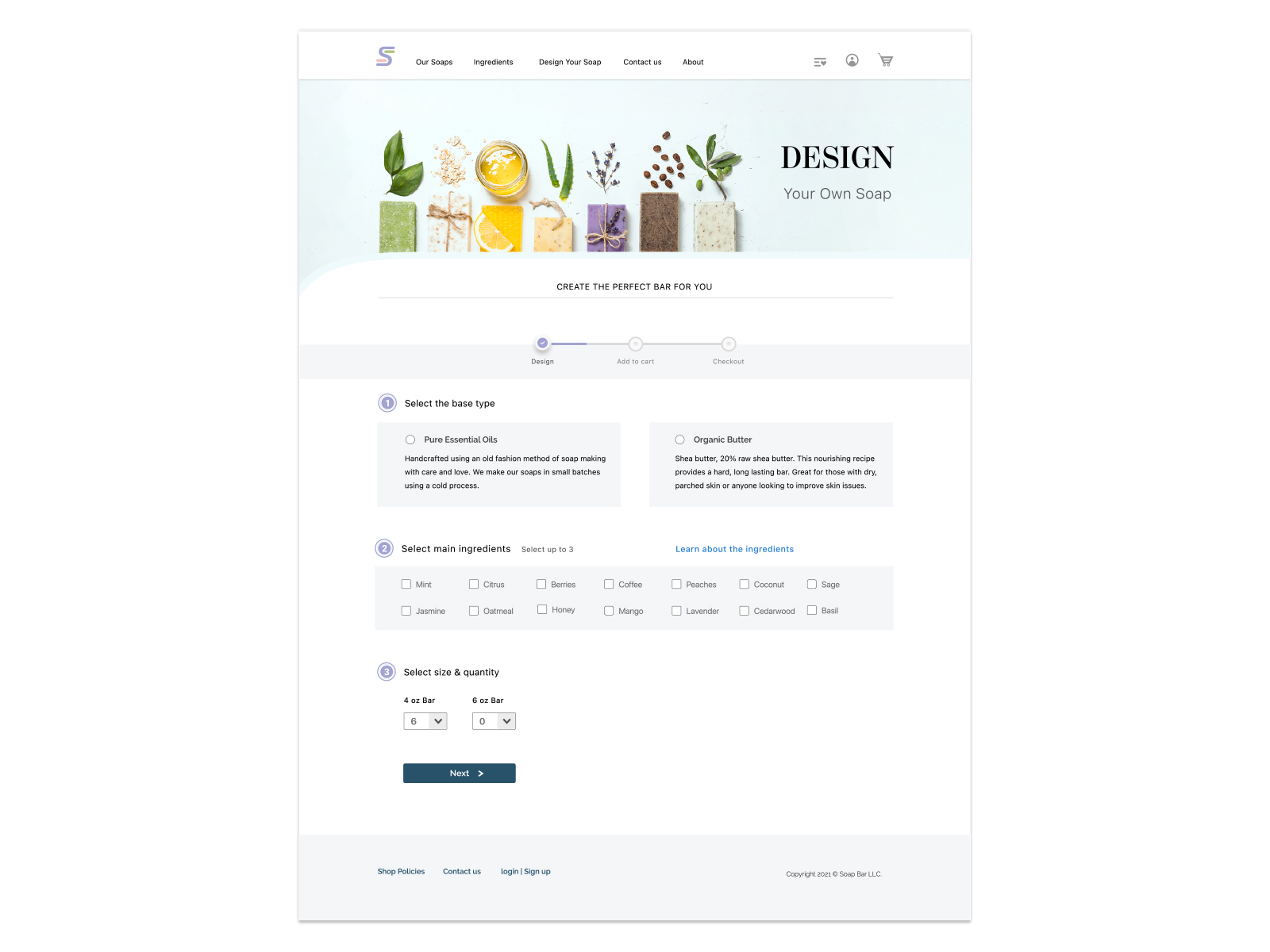
Design a user friendly interface for desktop and mobile to give the users the opportunity to design their own soap bar. The process must be easy for the user to understand and concise.
COMPETITIVE AUDIT
Other websites also offer custom made handcrafted soap, and many of those websites have a long process for the users to design their own soap. The standard process requires 4-8 steps or it has preset limitations in the selections of the ingredients, leaving little opportunity for users to make choices.
Also, it was noticed that other competitors’ UI place more emphasis in the product images and are very heavy in product introduction texts. Explanations of how to design the soap are long and repetitive.
WEBSITE MAP
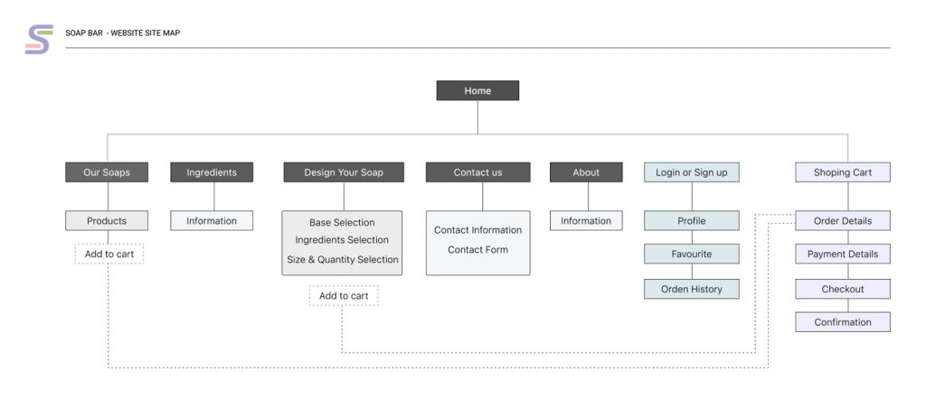
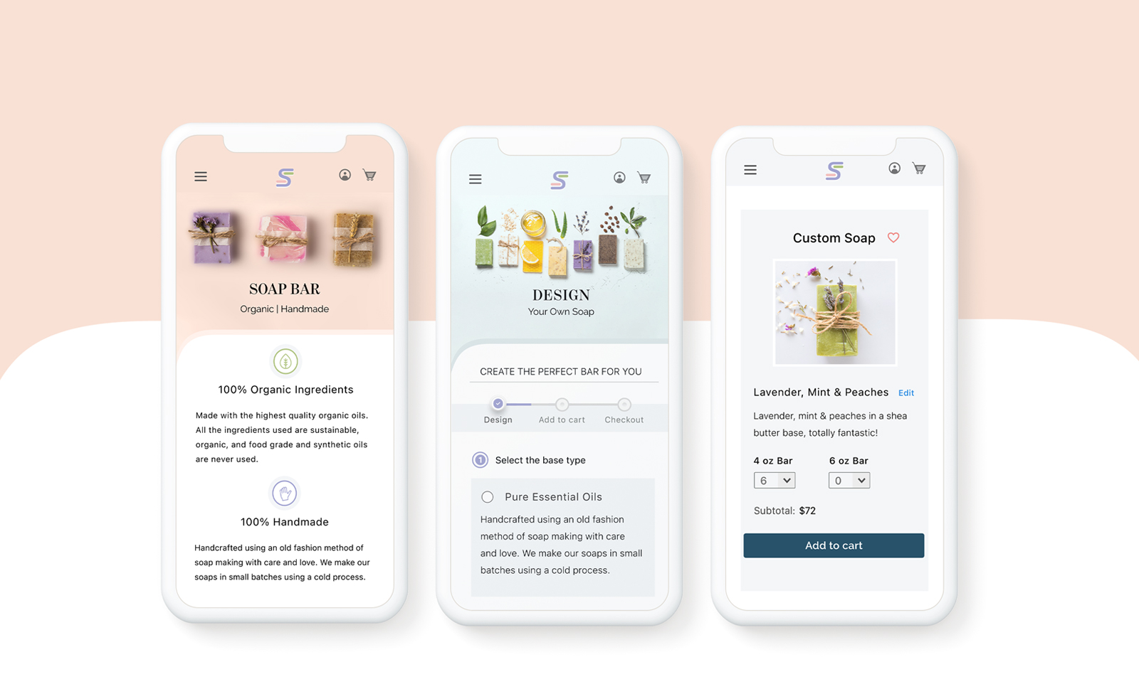
The website was designed with the objective to make the process of designing the soap bar short and easy, it presents the users with the 3 steps to select the ingredients for their soap. Each step is marked and easy to follow to reduce the user’s cognitive load:
- Soap base
- Soap botanical ingredients
- Soap size & quantity
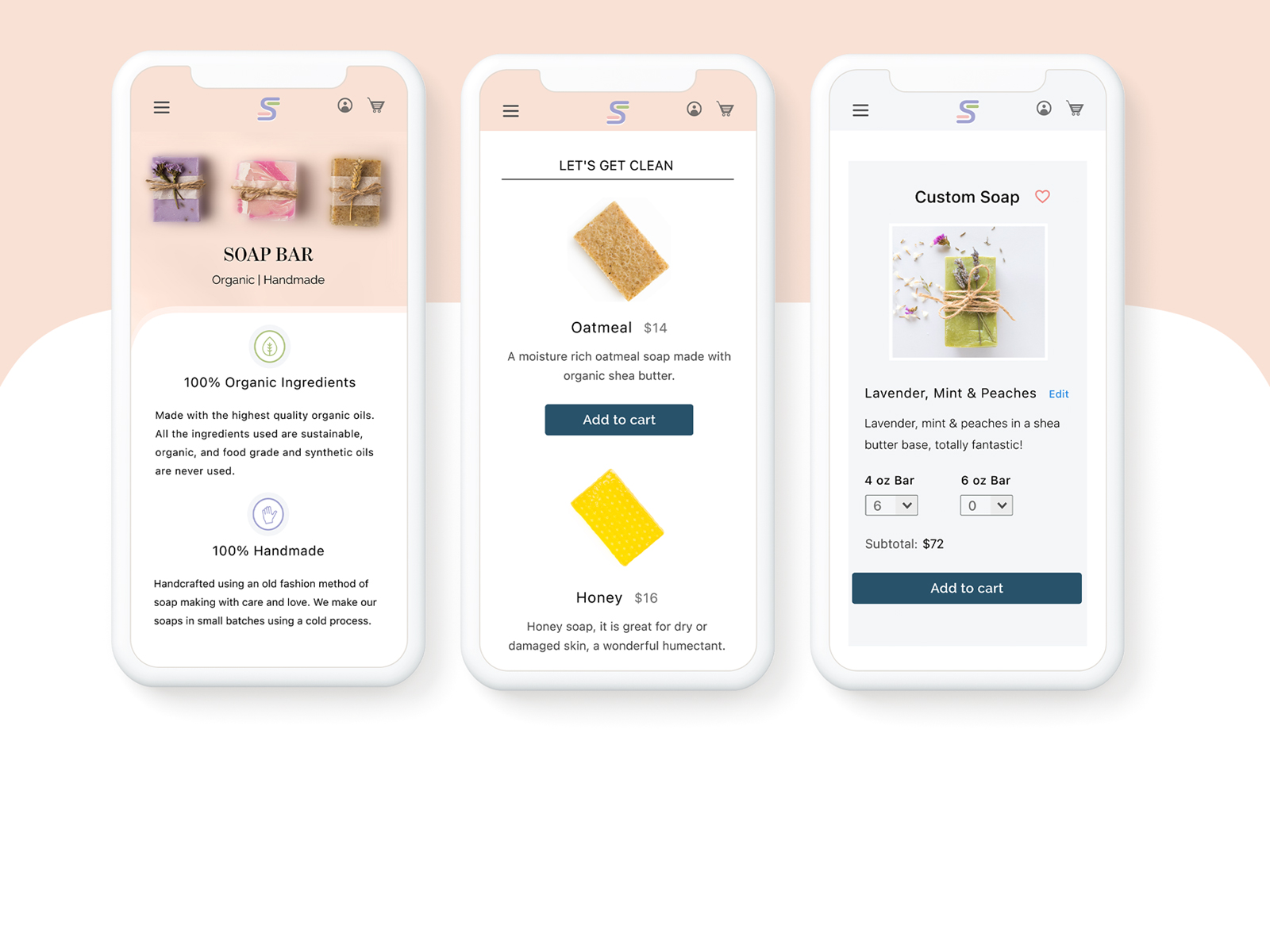
After designing their soap the users are then redirected to review the new product they designed and checkout.
WIREFRAMES
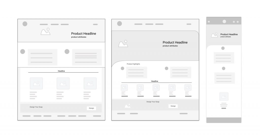
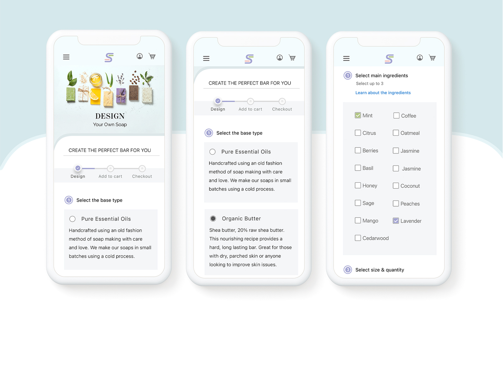
The wireframes were made for the desktop and mobile versions.
WEBSITE STYLE
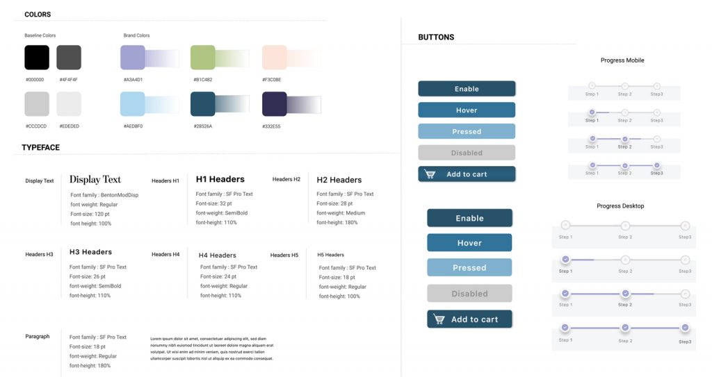
Designed for Desktop & Mobile
Typeface: SF Pro Text
Typeface Size: Smallest text at 16px
User tools: Linear progress indicators
Mobile: Touch target size of 26px. Finger-friendly design
USER JOURNEY
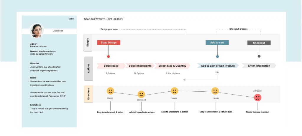
The design was tested in order to get insides into the user journey and make any necessary modifications, a major pain point for the user was the absence of express payment options.
USER DRIVEN CHANGES
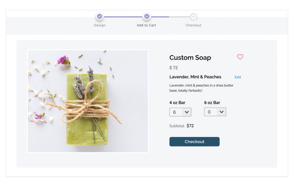
An “Edit” Product link was included to the Product Card to give the user more control.The user now has the opportunity to edit and make changes to the product before the checkout process.

More space was given to the ingredients selection to make it easier to read for the user.

